'%3e%3cpath%20d='M48.8611%2033.7489V28.6591C47.4125%2030.3035%2045.7681%2031.6347%2043.8888%2032.6135C42.0096%2033.5923%2040.0128%2034.1012%2037.9378%2034.1012C35.6278%2034.0621%2033.4353%2033.6706%2031.4386%2032.8092C29.4027%2031.9479%2027.6017%2030.7733%2026.0357%2029.2073C24.4696%2027.6803%2023.2559%2025.8794%2022.3945%2023.8043C21.5332%2021.7293%2021.1025%2019.5368%2021.1025%2017.266C21.1025%2014.9952%2021.5332%2012.8027%2022.3945%2010.7277C23.2559%208.65261%2024.4696%206.85163%2026.0357%205.28557C27.6017%203.7195%2029.4027%202.50579%2031.4386%201.68361C33.4353%200.82227%2035.6278%200.391602%2037.9378%200.391602C40.0911%200.391602%2042.0879%200.82227%2044.0063%201.72276C45.8856%202.62325%2047.53%203.8761%2048.8611%205.48132V1.05718H54.8905V33.7489H48.8611ZM33.7094%207.204C32.3391%207.75212%2031.1645%208.53516%2030.1857%209.51395C29.2069%2010.4927%2028.4239%2011.6673%2027.8758%2013.0376C27.3277%2014.4079%2027.0536%2015.8174%2027.0536%2017.3051C27.0536%2018.7929%2027.3277%2020.2024%2027.8758%2021.5335C28.4239%2022.8647%2029.2069%2024.0392%2030.1857%2025.018C31.1645%2025.9968%2032.3391%2026.7799%2033.7094%2027.328C35.0797%2027.8761%2036.4892%2028.1502%2037.9769%2028.1502C39.4647%2028.1502%2040.8742%2027.8761%2042.2053%2027.328C43.5365%2026.7799%2044.711%2025.9968%2045.6898%2025.018C46.6686%2024.0392%2047.4516%2022.8647%2047.9998%2021.5335C48.5479%2020.2024%2048.822%2018.7929%2048.822%2017.3051C48.822%2015.8174%2048.5479%2014.4079%2047.9998%2013.0376C47.4516%2011.6673%2046.6686%2010.4927%2045.6898%209.51395C44.711%208.53516%2043.5365%207.75212%2042.2053%207.204C40.8742%206.65588%2039.4647%206.38181%2037.9769%206.38181C36.4892%206.34266%2035.0406%206.65588%2033.7094%207.204Z'%20fill='white'/%3e%3cpath%20d='M6.8907%201.1354C8.49592%200.391517%2010.2186%200%2012.0587%200V5.95106C10.2577%205.95106%208.80914%206.57749%207.63458%207.83034C6.38173%209.1615%205.7553%2010.7276%205.7553%2012.4502V33.7488H0V12.4502C0%2010.062%200.626427%207.83034%201.84013%205.83361C3.05383%203.79772%204.73736%202.2708%206.8907%201.1354Z'%20fill='white'/%3e%3cpath%20d='M20.3196%203.36705C18.9884%204.93312%2017.9313%206.65579%2017.07%208.53507C16.9134%208.30016%2016.6785%208.06525%2016.4827%207.83034C15.3082%206.57749%2013.8596%205.95106%2012.0586%205.95106V0C13.8987%200%2015.6214%200.391517%2017.2266%201.1354C18.362%201.76183%2019.4191%202.50571%2020.3196%203.36705Z'%20fill='white'/%3e%3cpath%20d='M127.713%2013.6639V33.7487H121.84V13.6639C121.84%2011.6672%20121.096%209.90534%20119.648%208.45672C118.238%207.04726%20116.476%206.30338%20114.44%206.30338C112.405%206.30338%20110.643%207.00811%20109.233%208.45672C107.745%209.94449%20107.041%2011.6672%20107.041%2013.6639V33.7487H101.168V13.6639C101.168%2011.8238%20101.52%2010.1011%20102.225%208.45672C102.93%206.81235%20103.869%205.40289%20105.083%204.18919C106.336%202.93633%20107.785%201.95754%20109.39%201.29196C111.034%200.587229%20112.718%200.234863%20114.519%200.234863C116.32%200.234863%20118.003%200.587229%20119.648%201.29196C121.292%201.99669%20122.701%202.97548%20123.954%204.18919C125.168%205.40289%20126.108%206.81235%20126.812%208.45672C127.36%2010.1011%20127.713%2011.8238%20127.713%2013.6639Z'%20fill='white'/%3e%3cpath%20d='M66.7536%2033.7486H59.5889L79.3996%200.273926H86.5252L66.7536%2033.7486Z'%20fill='%2376BC21'/%3e%3cpath%20d='M72.6262%2047.9999H65.4614L93.6898%200.273926H100.855L72.6262%2047.9999Z'%20fill='%2376BC21'/%3e%3c/g%3e%3cdefs%3e%3cclipPath%20id='clip0_866_4589'%3e%3crect%20width='127.713'%20height='48'%20fill='white'/%3e%3c/clipPath%3e%3c/defs%3e%3c/svg%3e)
Your Dashboard Isn't a Decision Tool. It's a Very Expensive Report
By Ebtihaj Khan · July 15, 2026 · 1,474 words
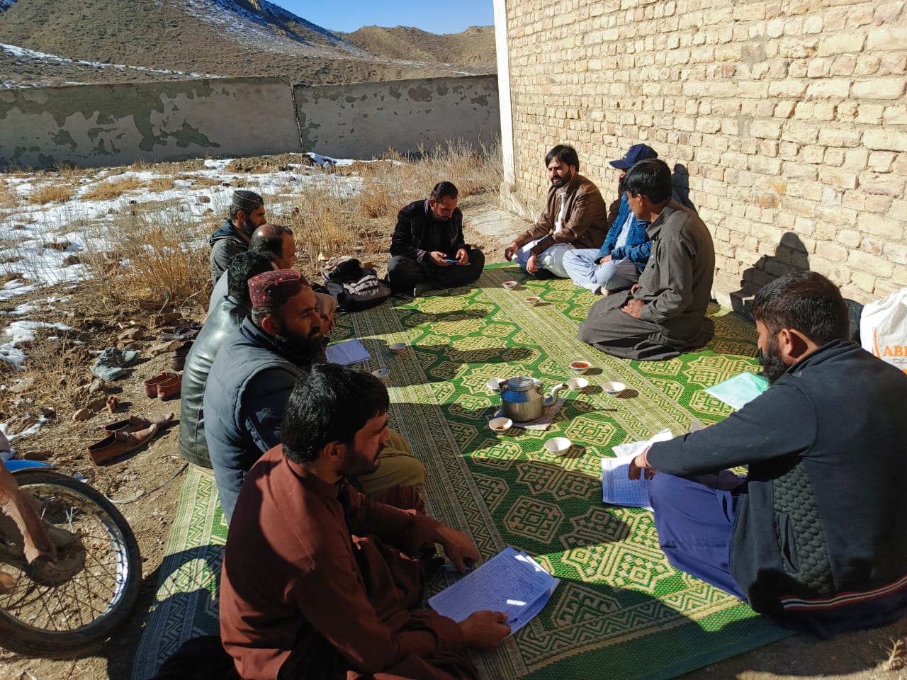
97% of the World's Data Never Gets Used. Ours Had to Be Used Within a Few Hours.
What global research on failed dashboards and five years of tracking 69,000 field workers across Pakistan's polio campaigns taught us about the difference between a report and a decision.
Gartner estimates that organizations fail to use almost 97% of the data they collect.¹ Between 60% and 70% of dashboards built inside large organizations are abandoned within months of launch; analysts have a name for where they end up: the dashboard graveyard.² A 2025 MIT study went further: 95% of enterprise AI initiatives deliver zero measurable return, not because the models are wrong, but because the insight they produce never connects to a decision anyone actually makes.³
For a national vaccination campaign that runs for a matter of days, that lag isn't an inefficiency. It's the difference between a missed household getting covered and getting missed for good.
Here is the uncomfortable part. This isn't a private-sector problem you can shrug off. The same pattern shows up in global health. DHIS2, the routine health information system used across more than 80 low- and middle-income countries—the largest of its kind in the world—has been scaled aggressively for two decades. A 2022 scoping review in BMC Health Services Research asked a simple question: is all that data actually being used for decisions? The answer was uneven at best. The review describes a "vicious data cycle": frontline workers see the system produce poor-quality output, stop trusting it, stop feeding it good data, and quietly build their own parallel records instead.⁴ A separate global study of COVID-19 dashboards found the same failure mode dressed differently: most dashboards lacked the basic features needed to make them actionable at all.⁵
So the question worth asking isn't "how do we collect more field data." Everyone already collects more field data than they use. The question is: what has to be true for field data to change what happens before the campaign that produced it has even ended, instead of describing what happened last quarter?
We've spent five years answering that question under conditions that don't forgive a wrong answer.
The Global Precedent: GIS Has Already Proved That Real-Time Field Tracking Closes Coverage Gaps
This isn't a new idea we stumbled into. Public health researchers have been building the evidence base for over a decade. A landmark study published in the Journal of Infectious Diseases tracked polio vaccination teams across northern Nigeria from 2013–2015 using GPS devices layered onto satellite imagery. The finding that mattered: team tracks overlaid on maps revealed that vaccination teams commonly missed entire swaths of contiguous households, gaps that paper-based reporting had no way of surfacing.⁶ WHO's African Regional Office built on this and stood up a dedicated GIS Centre in 2017, which went on to play a direct role in the region's wild poliovirus eradication in 2020.⁷
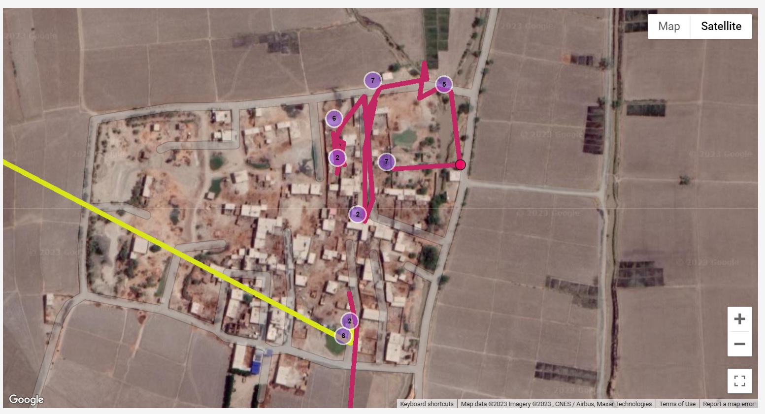
The research question was answered years ago: geospatial field data, fed back fast enough, closes coverage gaps that reporting alone cannot see. The harder question, the one that doesn't get answered in a journal article, is what it takes to make that loop run in a country where the phone in a field worker's pocket has a cracked screen, 2GB of RAM, and a connection that drops the moment they walk past the last cell tower.
What We Built, and the 24-Hour Test We Held Ourselves To
We built the Geographical Coverage Support System (GCSS) for Pakistan's Polio Eradication Initiative, GPS-based field tracking across more than 69,000 field workers through 22-plus national campaigns, running on top of 1,632 digitised union council boundaries that didn't exist in usable form when we started.
The design constraint we held ourselves to was simple to state and hard to hit: a missed area identified on any day of a campaign has to be visible to a supervisor and reassigned before the campaign ends, not flagged in a post-campaign evaluation three months later, when the children who were missed have already been missed.
That single constraint is what separates a report from a decision tool. A report is judged by whether it's accurate. A decision tool is judged by whether anyone changed course because of it, in time for the change to matter.
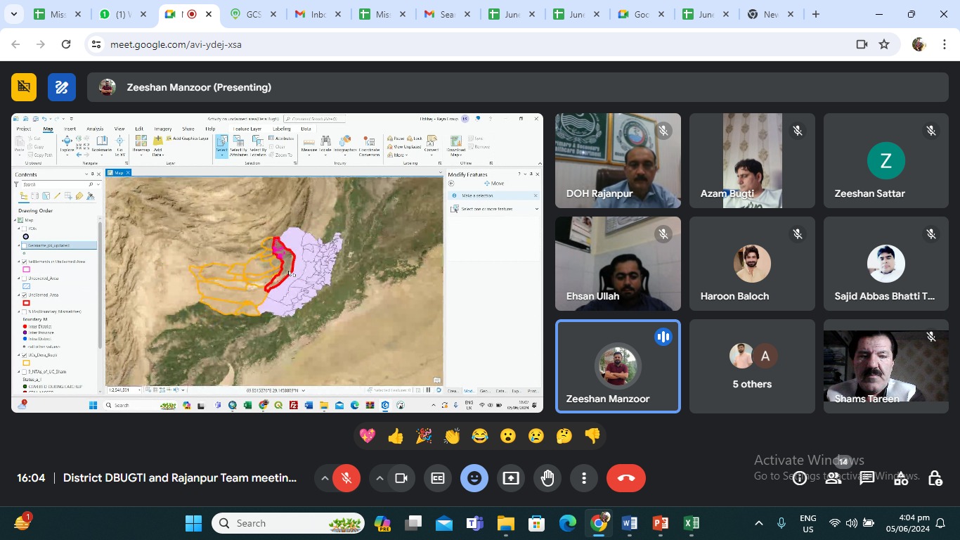
To hold that standard, three things had to be true simultaneously:
| Feature | A Report | A Decision Tool |
|---|---|---|
| Timing | Delivered after the window to act has closed | Delivered inside the window to act |
| Audience | Written for an evaluator | Built for a supervisor to act |
| Success Metric | "Is this accurate?" | "Did anyone do something different because of this?" |
The Part Global Research Doesn't Have to Solve: Designing for a 3-Year-Old Android Phone
Here is where Pakistan's own numbers matter. As of late 2025, 61.2% of Pakistan's population lives in rural areas, and while 79.5% of mobile connections in the country are technically capable of 3G/4G broadband, there remains a documented 52% usage gap, meaning coverage exists in places where actual use of mobile internet still doesn't.⁸ Smartphone ownership sits around 63%, and even where it's higher, the device in question is very rarely the newest one on the shelf.⁹
A GIS system designed against a research paper's assumptions—stable connectivity, a mid-range test device, a data-entry clerk sitting at a desk—simply doesn't survive contact with those numbers. So the design commitments we carry across our field systems aren't cosmetic:
- Built to work offline first: The app processes and saves data locally on the device before queuing it for the server. Syncing happens seamlessly in the background the moment a connection appears, ensuring the field worker never has to wait.
- Prioritized for low-connectivity sync: If a user gets only a few seconds of signal, like a moving car passing a cell tower, the system prioritizes critical infrastructure data, such as coverage gaps, over less urgent updates. Everything else waits its turn.
- Tested on the weakest devices in use, not the best: We test software performance on the oldest, slowest Android phones actively used in the field. If it runs smoothly there, it runs everywhere. The field device dictates success, not a manager's phone in the capital.
- Designed for a quick glance, not a long read: Dashboards are built for speed. A supervisor moving between sites needs a split-second answer on where a coverage gap lies, not a complex data visualization that requires sitting down to study.

None of this shows up in a case study slide. All of it shows up in whether the system is still being used, unprompted, in month eighteen of a campaign—which, per the global dashboard-abandonment numbers above, is exactly the point where most systems have already been quietly shelved.
The Generalisable Takeaway
Strip away the health-sector specifics and the pattern applies to any field programme measured by coverage, reach, or compliance (such as cash transfer verification, disaster response logistics, agricultural extension, or facility inspections):
- Identify the Decision First: Ask what decision the data needs to change, and by when, before you design what the data looks like. If no one can name the decision and its deadline, you're building a report, however good the dashboard looks.
- Design for the Baseline: Design for the worst-connected, oldest device your field force actually carries, not the device your test team carries. The usage gap between "covered" and "connected" is where field systems quietly die.
- Outcome over Output: Measure success by what changed, not by what was collected. Gartner's 97% and MIT's 95% are the same finding twice: collection was never the bottleneck. Action was.
While global research established the theory years before we built a single tool, our fieldwork proved something far more practical: impact doesn't require the latest technology. A frontline worker with a cracked-screen Android and zero signal can still ensure a missed household is covered before the campaign round closes.
References
Figures reflect the most recent data available as of mid-2026.
- Gartner, cited in Strategy Insights, "Dashboards are fading and 70% of enterprise data goes unused."
- Ibid.; Morant McLeod, "Decision Science vs. Data Dashboards: Why Most Analytics Programs Don't Change Decisions."
- MIT enterprise AI ROI study (2025), cited in Morant McLeod, op. cit.
- "Routine use of DHIS2 data: a scoping review," BMC Health Services Research (2022).
- "Exploring Changes to the Actionability of COVID-19 Dashboards Over the Course of 2020," PMC (2021).
- "Tracking Vaccination Teams During Polio Campaigns in Northern Nigeria by Use of Geographic Information System Technology: 2013–2015," Journal of Infectious Diseases, Oxford Academic.
- "Geographic information system and information visualization capacity building… WHO African region," PLOS ONE.
- DataReportal, "Digital 2026: Pakistan."
- GSMA, The Mobile Gender Gap Report 2025.